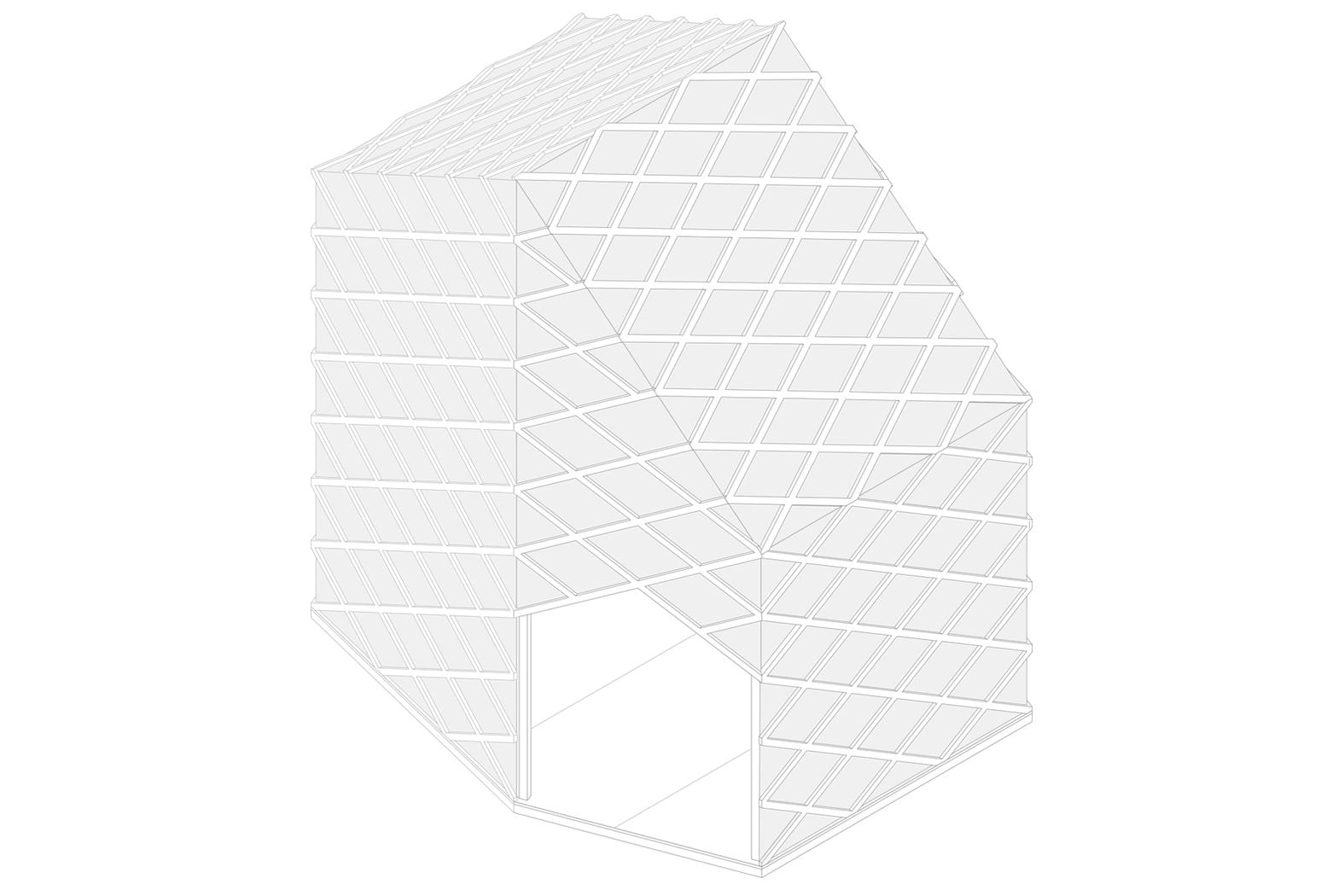
Flagship Shelters / Bottle Collectors VIP is a project from Superflex designed and produced in collaboration with KWY and Colectivo Warehouse.
The project was shown in the 2016 edition of Roskilde Festival and was present in the Art Zone under the artistic theme of that edition: “equality”.
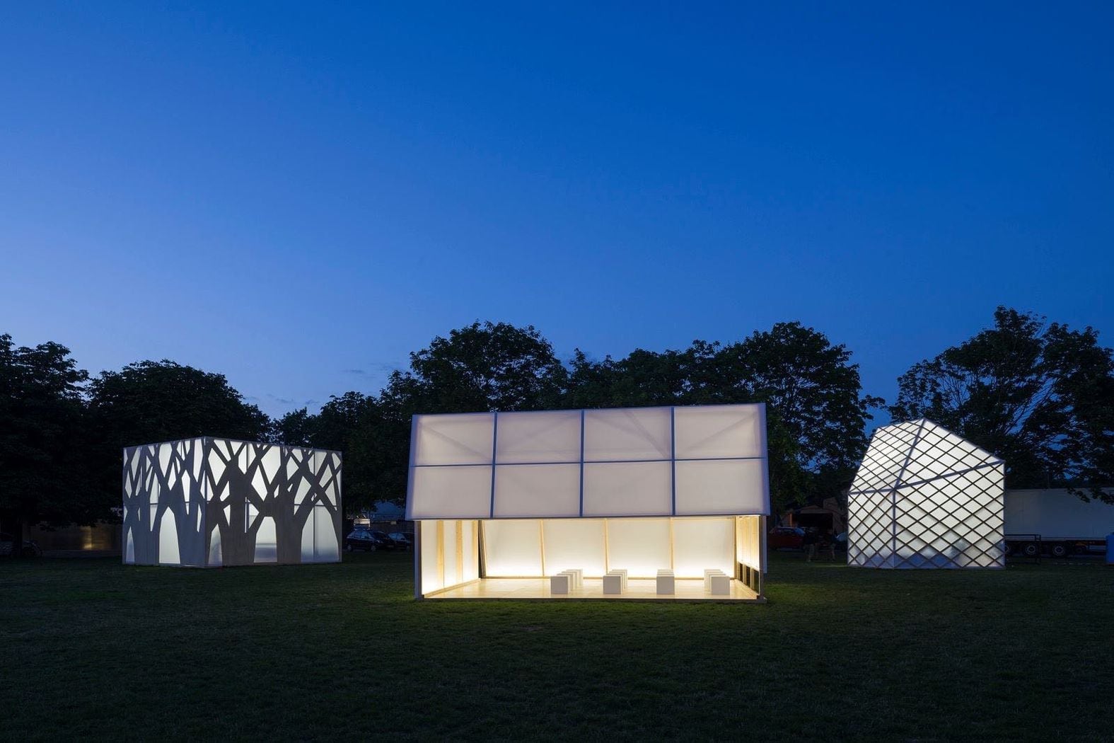
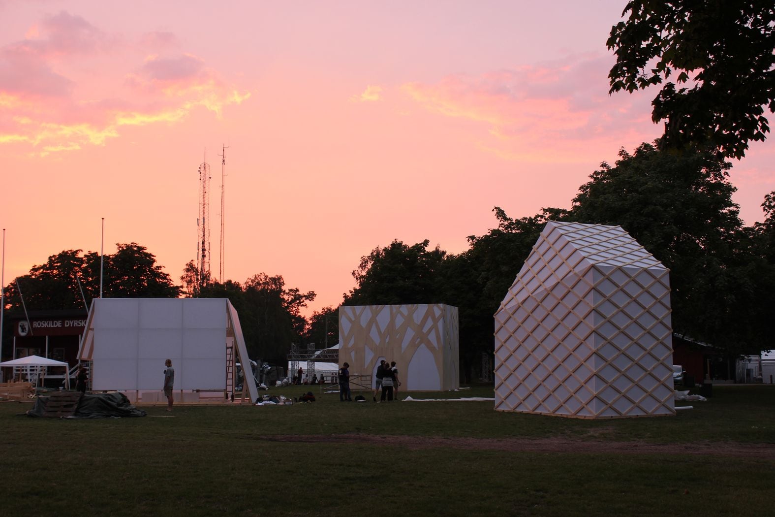
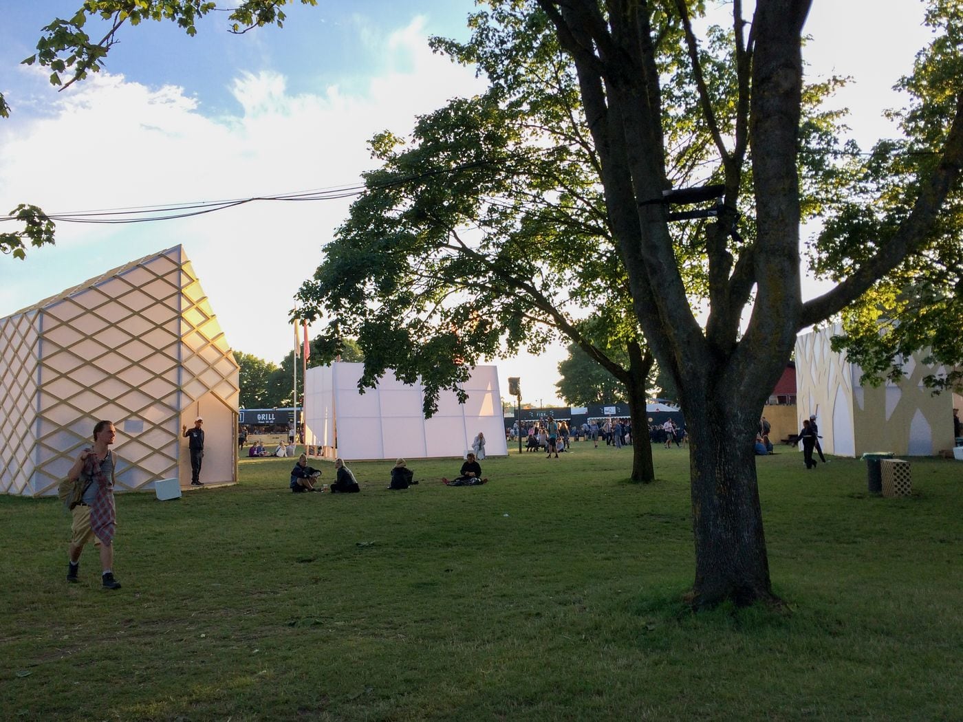
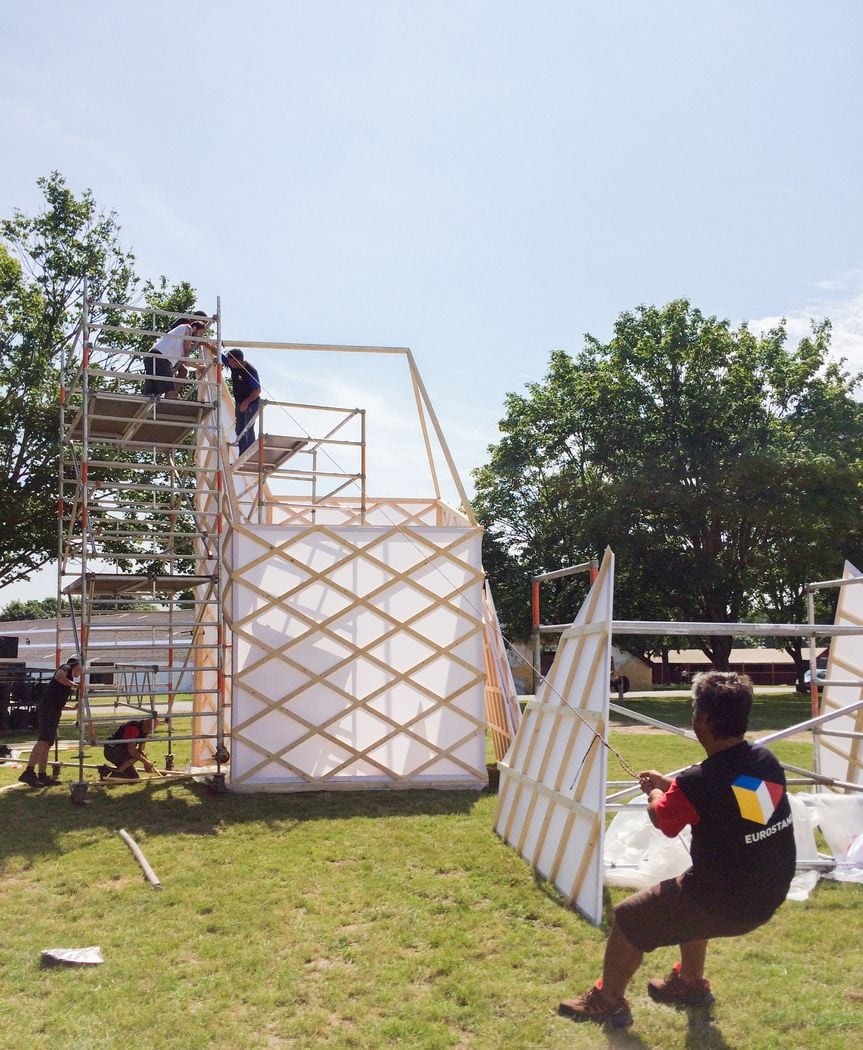
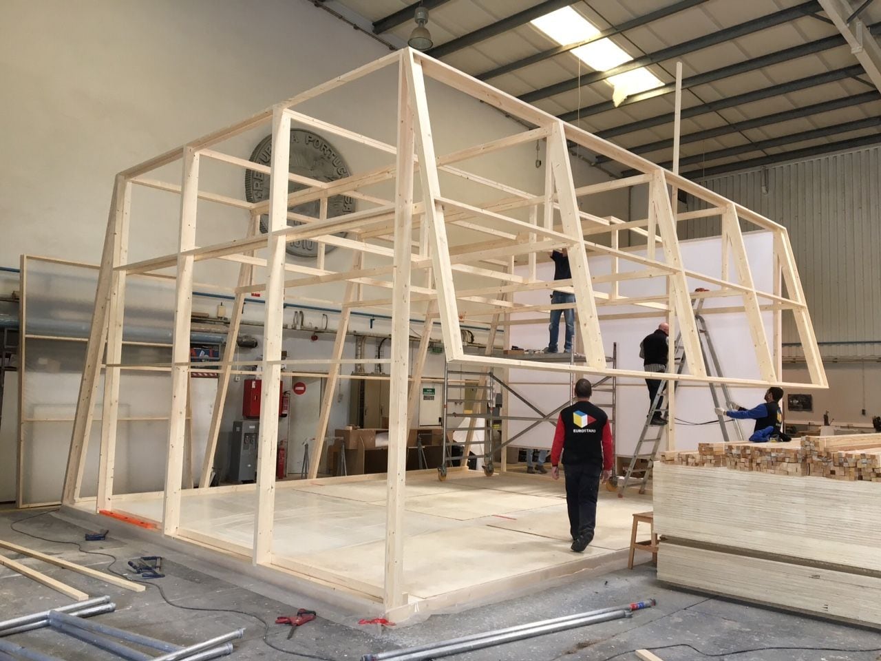
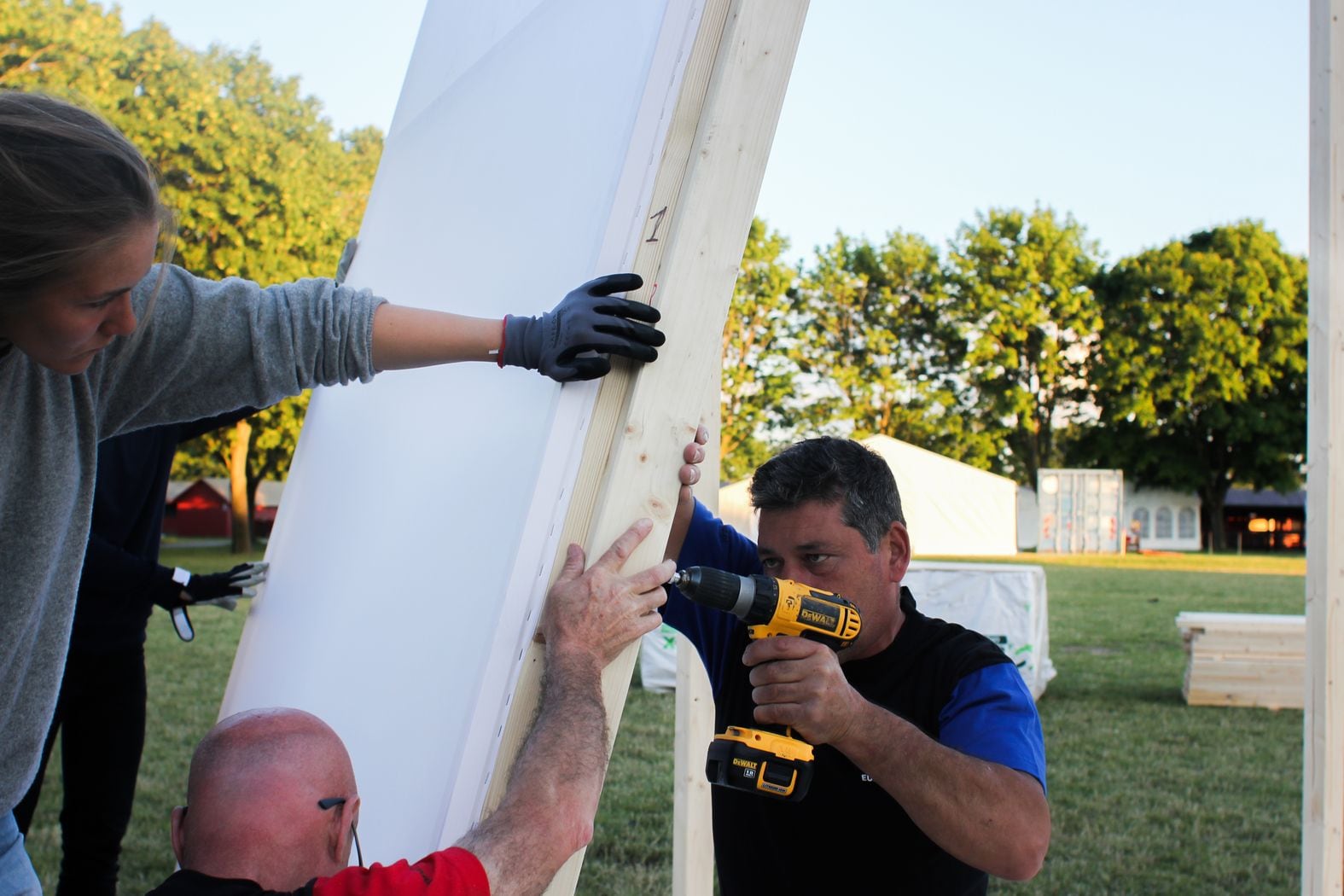
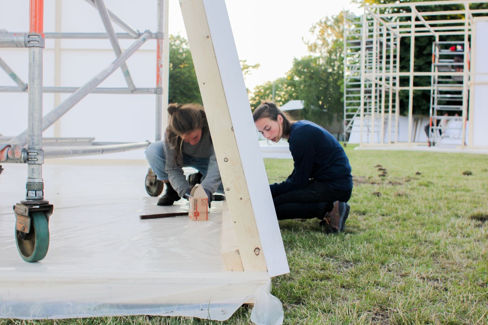
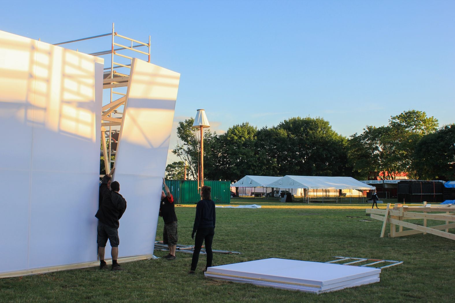
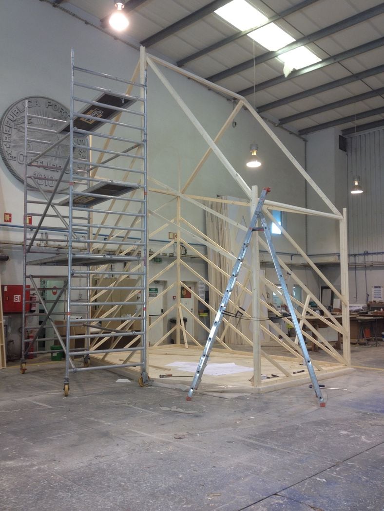
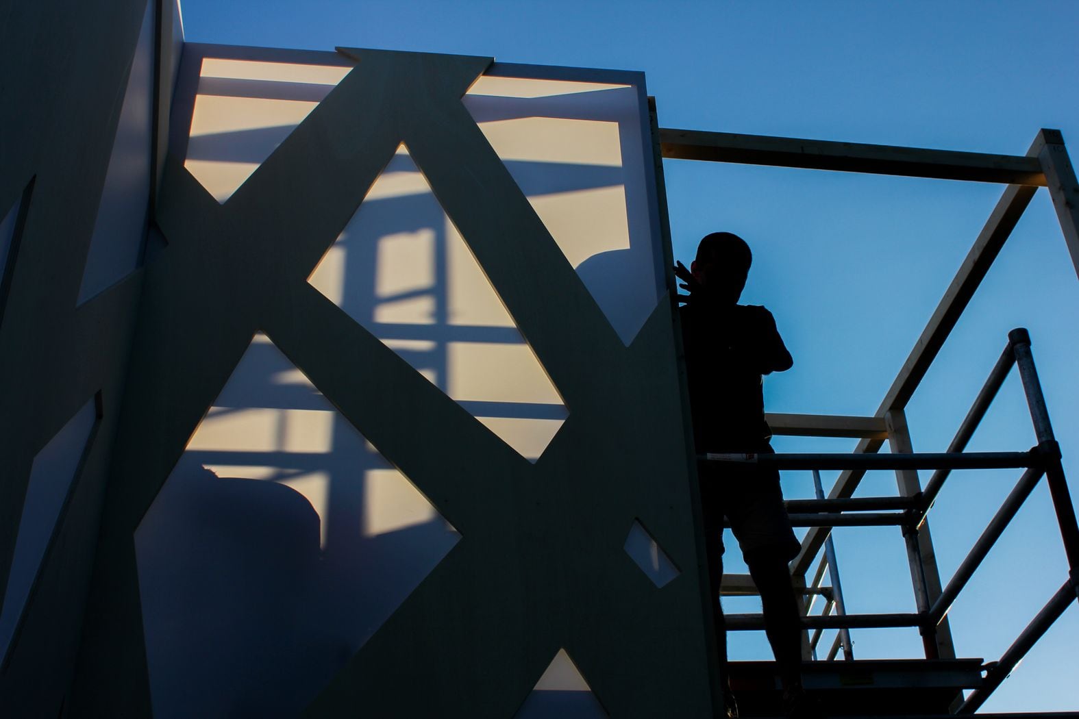
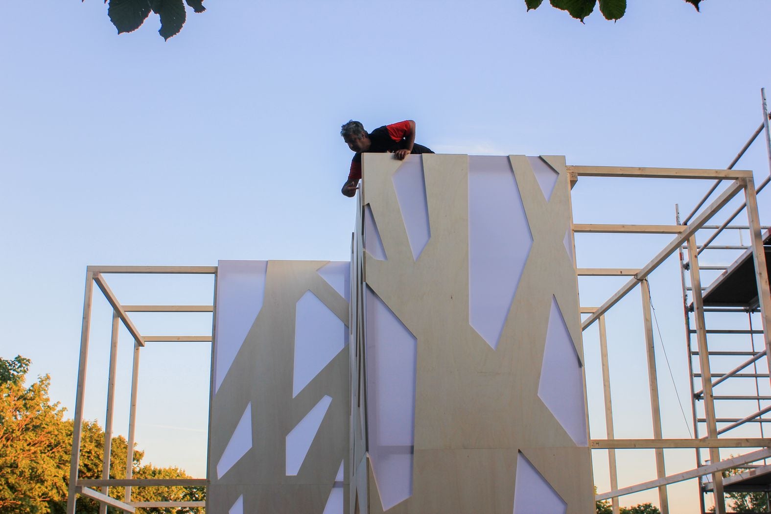
Flagship Shelters / Bottle Collectors VIP was inspired by three of the most famous and exclusive fashion stores’ headquarters in Tokyo designed by superstar architects. Through the critical reinterpretation of this contemporary architecture icons were proposed three pavilions with a smaller scale and build with basic and accessible materials such as Nordic pinewood and translucent white plastic.
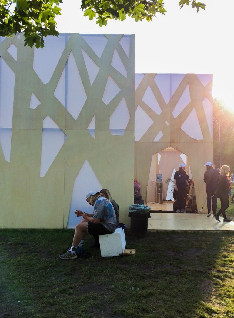
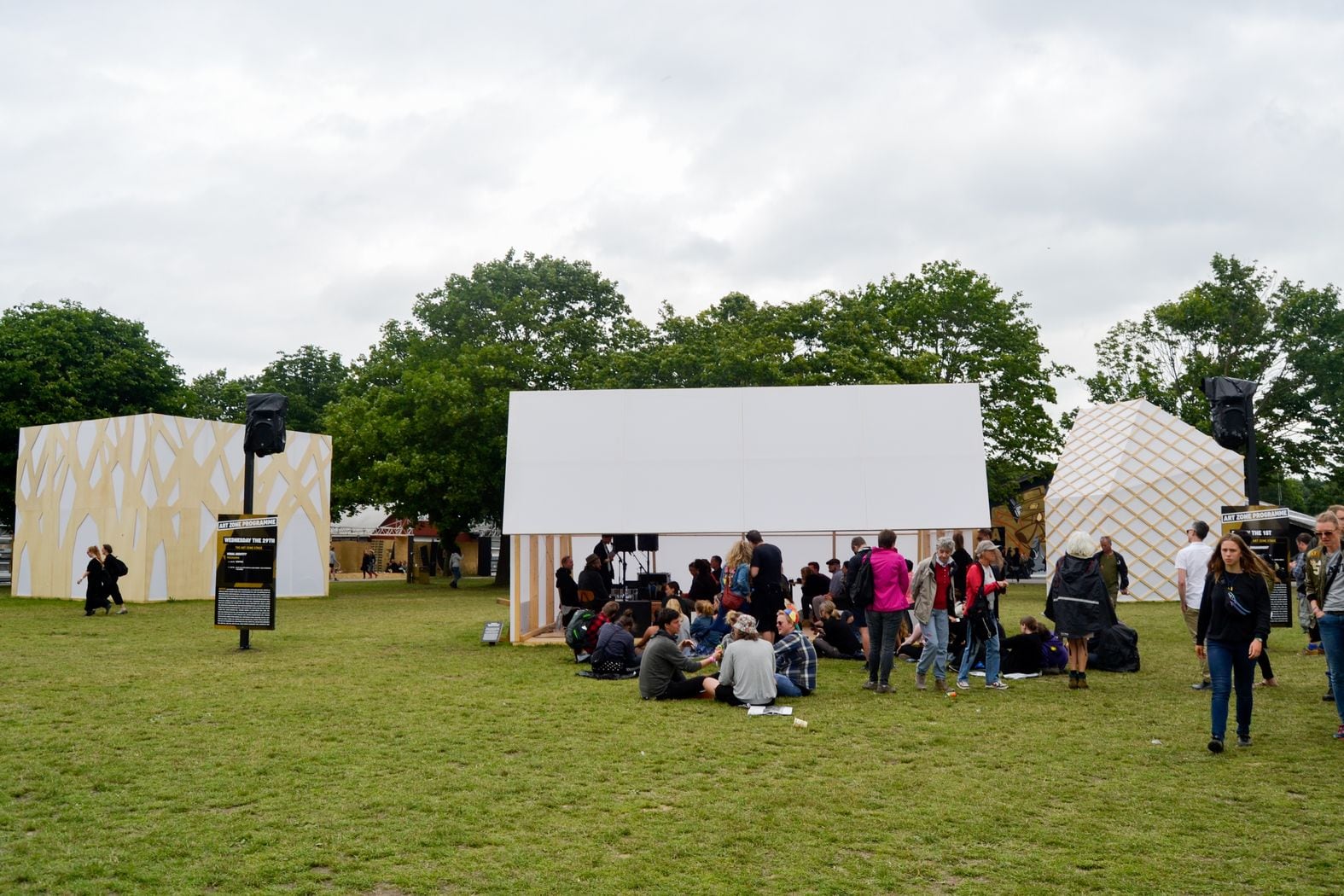
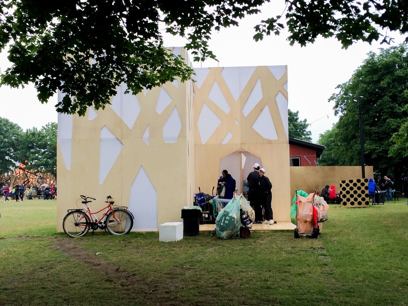
Two pavilions were used as recreational VIP-lounges for the bottle collectors at the festival. They offered several services such as catering, computer and Internet access, etc. The third pavilion worked as a small stage in Art Zone for panel discussions, debates and performances.
Flagship Shelters / Bottle Collectors VIP is the result of a critical thought of Superflex about the growth of social and economic inequality.
Taking as starting point the festival itself, the observation is based on the ambiguity between people who goes to listen music and enjoy the festival and those in a parallel reality where the festival is an essential source of income by the collection and reuse of waste.
PRADA
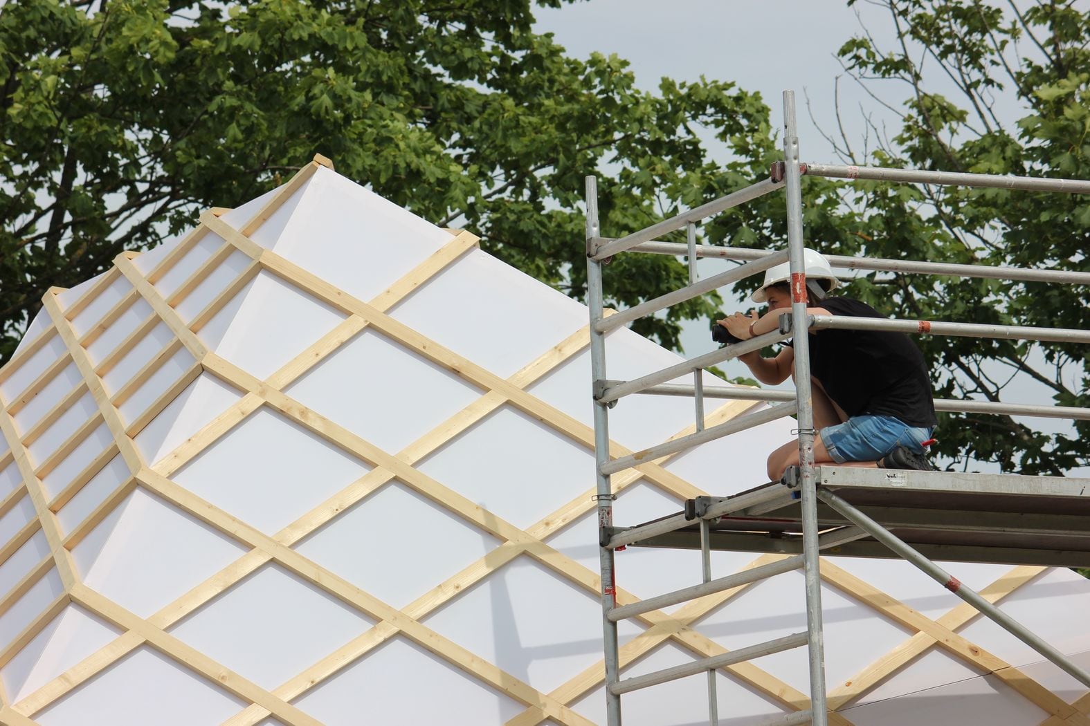
worked as one of the pavilions to accommodate the bottle collectors. The pentagonal structure reaches the 6.00m heights becoming the highest of the three pavilions. The analogue building is the Prada store in Tokyo that was designed by the Swiss architects Herzog & de Meuron. The primary element of the building is the lozenge. It spreads regular for all building plans, facades and roof.
TOD’S
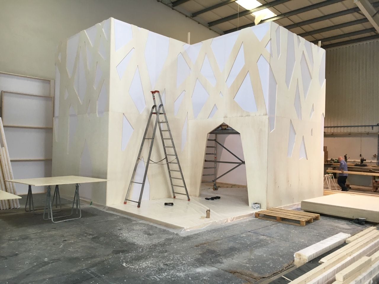
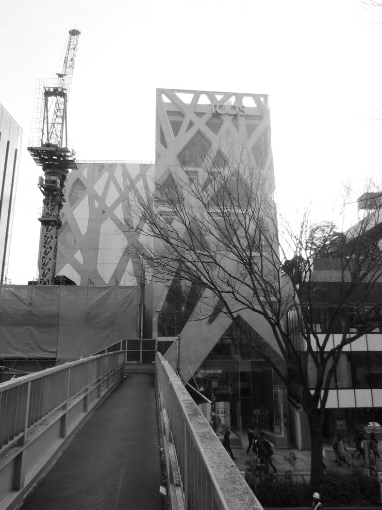
This pavilion was also used as rest area for the bottle collectors. It is analogue to the store designed by Japanese architect Toyo Ito for Tod’s. The pavilion is developed in an orthogonal mesh that contrasts with the organic design of the façade. The façade design is a metaphor symbolizing a tree and it’s the same in both projects.
MIU MIU
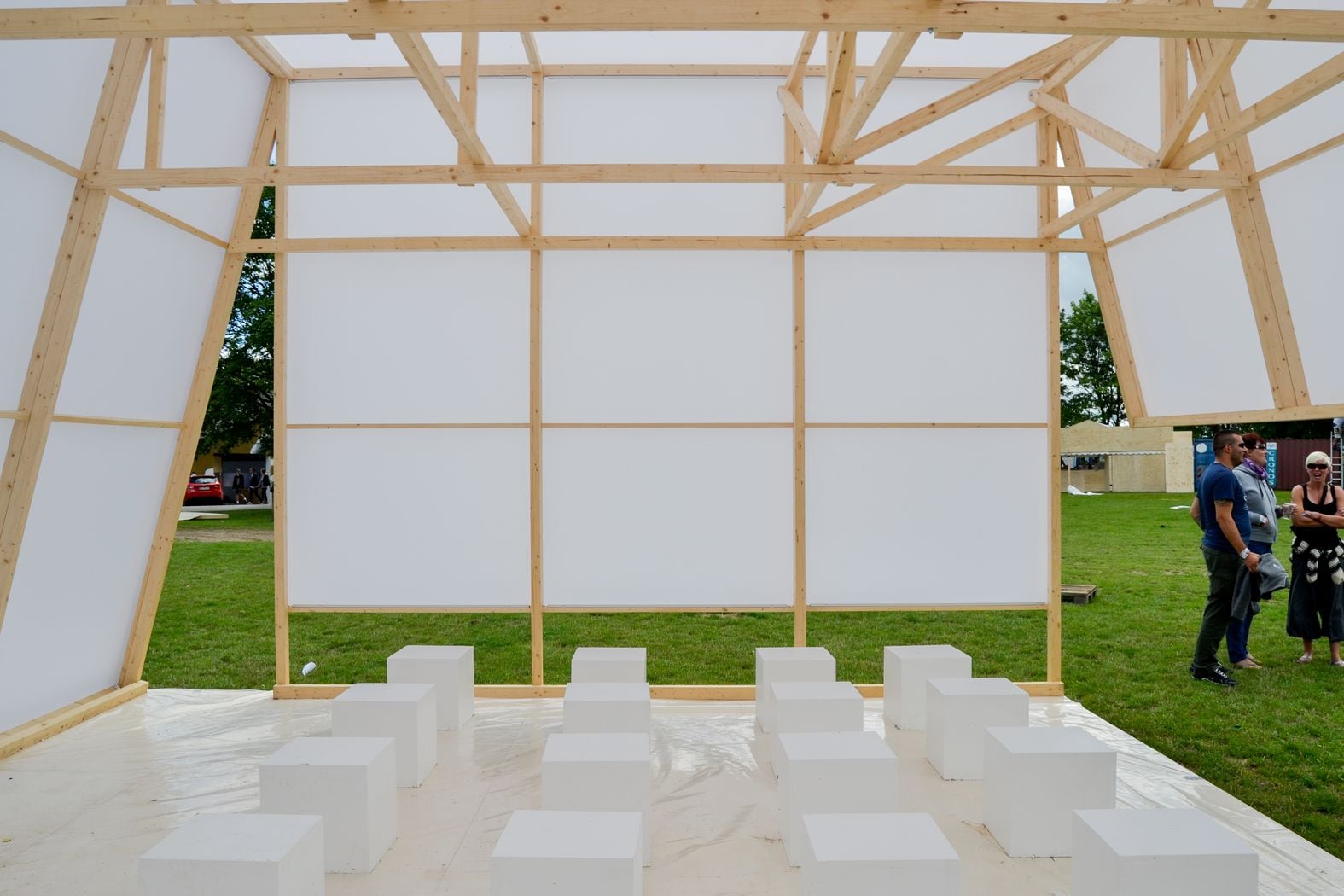
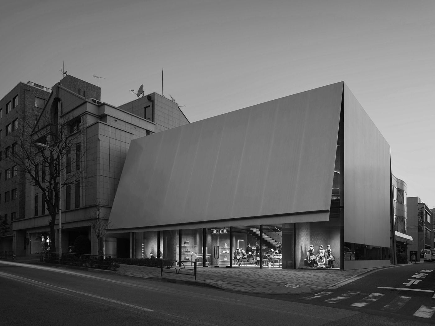
Unlike the other pavilions, this one was used as a small stage in Art Zone for panel discussions, debates and performances open to the general public. The pavilion is analogue to the Miu Miu store also designed by Herzog & de Meuron. The original building resembles an open cardboard box. The structure reveals the idea that the building does not rest on the floor due to the dematerialization of the structural elements and the visual permeability of the interior provided by the voids on the facades.
Team: SUPERFLEX+ KWY+ Warehouse
Partners: Eurostand, A2P
With: Rúben Teodoro, Ricardo Morais, Sebastião de Botton, Malin Mohr
Collaborators: Cian Mckenna, Caroline Nordfalk, Amalie Zahle, Liam Marosy-Weide, Helene Hov, Jakob Jorgensen
